Edit your content
Nuxt Studio offers a versatile workspace for both developers and content writers, giving them the freedom to choose between our differents editors:
- Notion-like editor for
Markdownfiles - Form editor for
YAMLandJSONfiles - Code editor for any kind of files (for technical users only)
Each editor serves its own purpose. Some users are used to code edition, while others prefer a non-technical, visual approach. At the end, code syntax is the final output for both editors.
Notion-like editor (Markdown files)
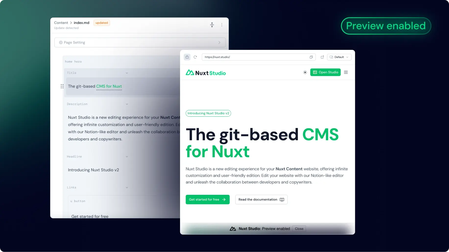
This editor is heavily inspired by Notion, well known for its intuitive design and flexibility. Much like a standard text editor, this editor is designed to be familiar and easy to use. However, it stands out with its additional features that improve the writing experience.
Frontmatter
Frontmatter is a convention of Markdown-based CMS to provide meta-data to pages, like description or title or any other data you would like to store as key: value pair.
Based on the user collection and schema provided, a form is generated to edit this metadata from the editor.
Toolbar
Highlight your text to reveal the toolbar, giving you access to all the standard text editing features (title formatting, Bold, Italic, Strike-through, code, link, class, bullet list, numerated list...).
Medias
Users can simply drag and drop images directly into the editor. An upload modal will open to let you choose the destination folder.
By typing / and searching for Image or Video, they can quickly insert a media. A modal will open to let them choose the media they want to insert from the media gallery (aka thepublic folder of the Nuxt application).
From the media modal, you can set the alt attribute for SEO and accessibility purpose.
Vue Components
One of this editor standout features is its ability to integrate and customize any complex Vue component directly within the editor.
Create and integrate your own component
A developer can create any kind of visually complex components and editors will be able to use them and focus on the content. An editor can also play with the component properties, styles, and behaviour to fit its specific requirements as long as the developer made it customisable.
Create your component
You can create Vue components and integrate them into Markdown. They just need to be located in the /components/content folder to be available.
<template>
  <div class="flex items-start gap-3">
    <div class="flex items-center justify-center border rounded-lg p-1.5">
      <UIcon :name="icon" />
    </div>
    <div class="flex flex-col">
      <h3 class="font-semibold">
        <slot name="title" />
      </h3>
      <span>
        <slot name="description" />
      </span>
    </div>
  </div>
</template>

<script setup lang="ts">
defineProps({
  icon: {
    type: String,
    default: 'i-ph-cursor-click',
  },
})
</script>
Integrate these components easily within any Markdown file using MDC syntax
::home-feature
  ---
  icon: i-mdi-vuejs
  ---
  #title
  Embedded Vue components
  #description
  Edit slots and props inside the Notion-like editor.
::
Edit them with our Studio editors
The visual editor simplifies the component edition, allowing you to integrate and edit them directly in the visual editor. Non technical users can play with slots and props without any technical knowledge.
All components in the /components/content folder are available in the editor. Studio users can type / anywhere while editing to access the list of available components.
Integrate built-in components from external libraries
By default, you can integrate any component inside a Markdown file and it should work and be editable from Studio but external components won't be displayed in the components list in Studio and can't be integrated manually by a Studio editor.
To list this component inside Studio and fetch all its metadata, you need to set it as global in your Nuxt config file.
Here is an example to integrate Button and Icon components from the Nuxt UI library:
export default defineNuxtConfig({
  hooks: {
    'components:extend': (components) => {
      const globals = components.filter(c => ['UButton', 'UIcon'].includes(c.pascalName))

      globals.forEach(c => c.global = true)
    }
  },
})
Form editor
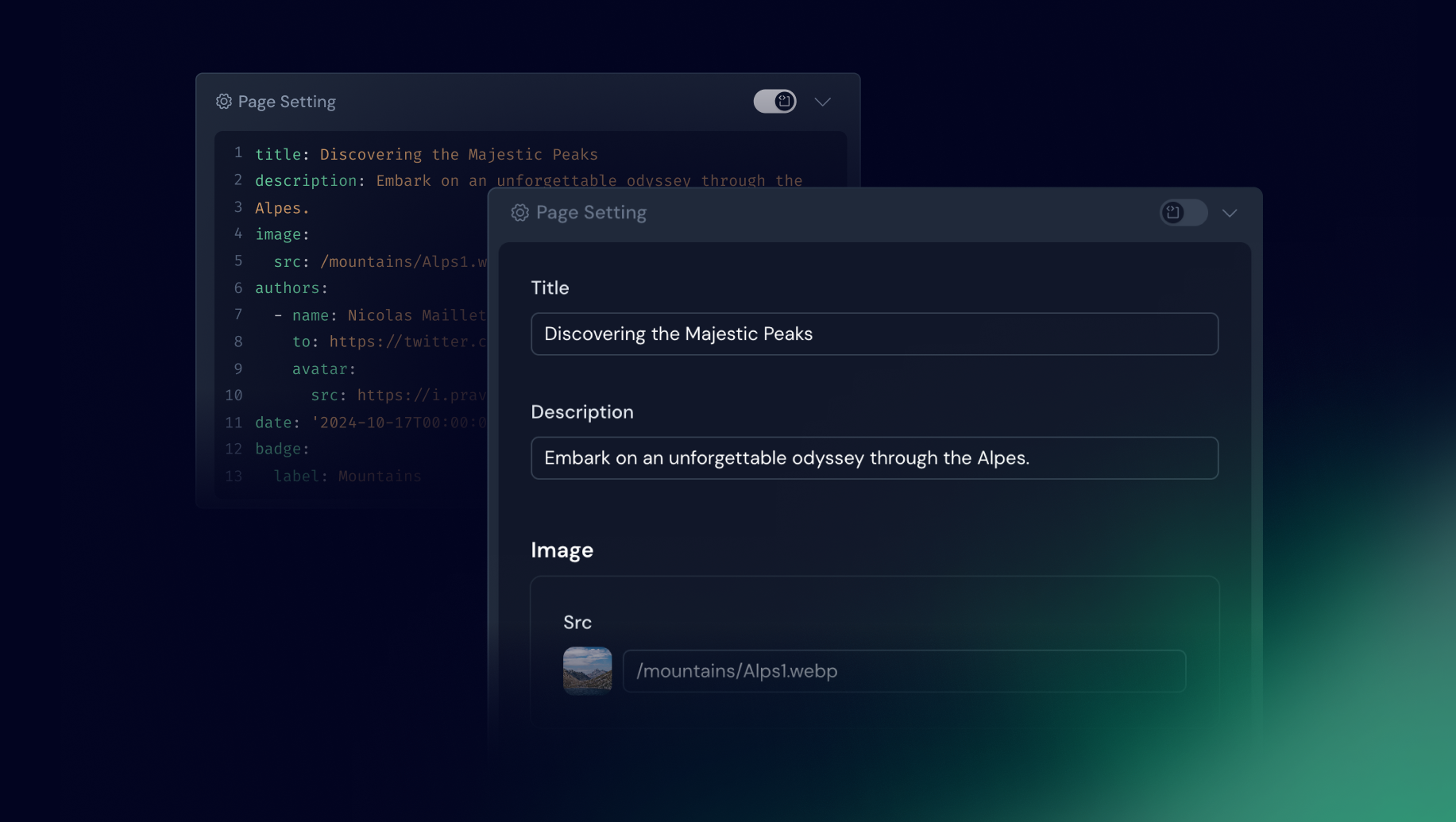
This editor is used whether you’re editing the of a Markdown file or a JSON / YAML file.
It eliminates the need to interact directly with complex file syntax. Instead, a form is automatically generated based on the provided user collection schema.
Defining your form with zod Schema
Once the schema property has been defined in your collection, this will automatically generate the corresponding form on Studio interface.
export default defineContentConfig({
  collections: {
    posts: defineCollection({
      type: 'page',
      source: 'blog/*.md',
      schema: z.object({
        draft: z.boolean().default(false),
        category: z.enum(['Alps', 'Himalaya', 'Pyrenees']).optional(),
        date: z.date(),
        image: z.object({
          src: property(z.string()).editor({ input: 'media' }),
          alt: z.string(),
        }),
        slug: property(z.string()).editor({ hidden: true }),
        icon: property(z.string().optional()).editor({ input: 'icon' }),
        authors: z.array(z.object({
          slug: z.string(),
          username: z.string(),
          name: z.string(),
          to: z.string(),
          avatar: z.object({
            src: z.string(),
            alt: z.string(),
          }),
        })),
      }),
    }),
  },
})
Native Inputs Mapping
Primitive Zod types are automatically mapped to appropriate form inputs in:
- String → Text input
- Date → Date picker
- Number → Number input (counter)
- Boolean → Toggle switch
- Enum → Select dropdown
- Arrays of strings → List of badge inputs
- Arrays of objects → Accordion of items with embedded form
Custom Inputs Mapping
Studio goes beyond primitive types. You can customise form fields using the editor method, which extends Zod types with metadata to empower editor interface.
This allows you to define custom inputs or hide fields.
Usage
// Icon
icon: property(z.string()).editor({ input: 'icon', iconLibraries: ['lucide', 'simple-icons'] })

// Media
image: property(z.string()).editor({ input: 'media' })
Options
input: 'media' | 'icon'
You can set the editor input type. Currently icon and media are available.
iconLibraries: Array<string>
Specifies which Iconify libraries to display. Use this option to filter and limit the available icon sets.
hidden: Boolean
This option can be set to avoid the display of a field in the Studio editor.
Code editor
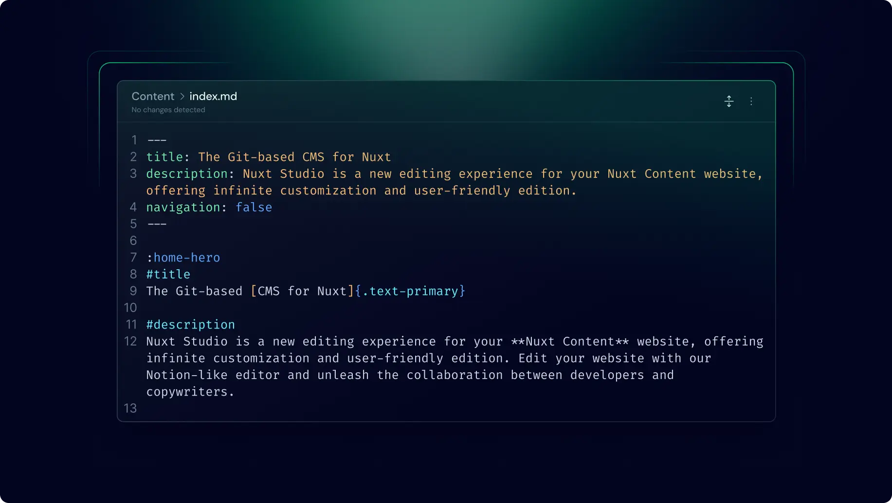
Even though the two previous editors are dedicated to a specific file extension (md or yaml/json). The code editor can be used with any kind of file.
It provides full control over your content, allowing you to write raw content directly:
When your file is saved with the code editor, the content is stored exactly as you've written it, preserving all specific syntax and formatting. This editor is ideal for users comfortable with code syntax (Markdown, YAML or JSON) who want precise control over structure of their content.